Nokia reshaping its company strategy and brand

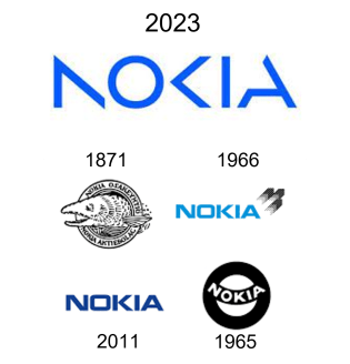
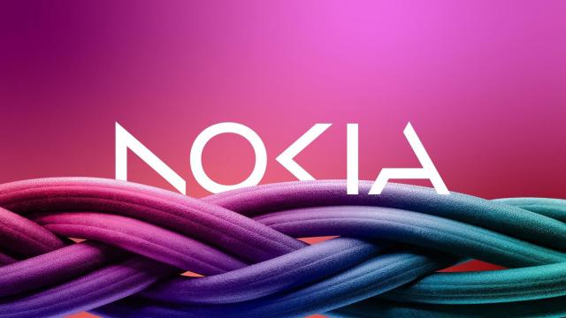
The cover photo is a new Nokia logo, announcing not only a refresh of an iconic brand, but also a new corporate strategy. Just a day before MWC2023, Nokia shocked the world by changing its iconic and well-known logo. The Nokia logo has changed with time, which is normal as change is the only constant in this world. However, the new logo moves away from the classic, proven and well-known Nokia logo, turning a new page in Nokia’s history. The modern logo, which reminds me of some modern DJ logos (David Guetta, Steve Aoki), is meant to represent all the energy Nokia is putting into the change that started over 10 years ago.

The new logo definitely raises many questions, and the first one that comes to my mind is how all this will be reflected in the new Nokia products. Looking at the new strategy shift Nokia announced in the press release, the new brand could mean a further distancing from consumer products, especially phones, as many people still associate the latest Nokia phones with Nokia itself. If new Nokia-branded products continue to be launched with the old brand, it could mean that I am not sure if new Nokia devices The licensing agreement could still use the old Nokia logo for the branded products, as many new Nokia products still appear with the old logo. However, all the products we see today were developed long before the new logo was approved, so devices with the new logo may not hit the market until later this year or in 2024.

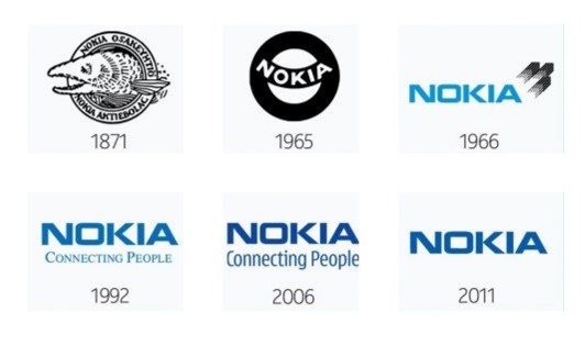
The new logo was a shock to me, but if you look at the evolution of the Nokia logo throughout history, the change in logos between 1965 and 1966 was also drastic. It will certainly take some time for many people to get used to the new logo, which could finally sever the connection with the old Nokia, which ceased to exist with the demise of the Devices and Services division.
So the change is here and it’s not going to go away whether we like it or not, and that’s what we can expect from Nokia in the future. The renewed strategy will drive Nokia to expand its networks more into the cloud space to exploit the exponential potential of networks and meet the future demands of the metaverse. Nokia will also focus even more on B2B technology innovation to drive digitization across all industries. The main goal is to increase efficiency, flexibility and productivity in a sustainable way, which is reflected in the dominant green-blue color scheme of the Nokia logo.

The strategy is based on six pillars, which probably stand for 6G or all the needed efforts to create the future version of the networks:
- Grow market share with service providers, driven by continued technology leadership;
- Expand the share of Enterprises within its customer mix;
- Continue to manage its portfolio actively, to ensure a path to a leading position in all segments where it decides to compete;
- Seize opportunities from sectors beyond mobile devices to monetize Nokia’s IP and continue to invest in R&D for Nokia Technologies;
- Implement new business models, such as as-a-Service; and
- Develop ESG into a competitive advantage and become the “trusted provider of choice” in the industry.
The power of n!
Update
I have contacted Nokia Mobile regarding the visual changes to the Nokia logo and will bring their comment in a new post.
HMD Global responded with the following reply: “HMD Global, the home of Nokia phones, will continue to use the classic Nokia logo.”
This might confirm my thoughts of branded devices (phones, TV’s, audio and other accessories) to continue using the old logo and Nokia pushing a new one only for its core business. I’m still waiting on a reply from Nokia itself on this.
Share your thoughts on this!


