HERE WeGo releases new UI for the stable version of the app

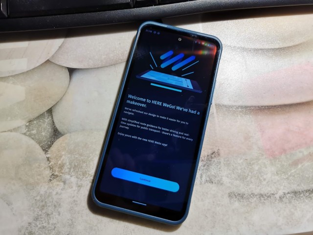
HERE WeGo released a new version of its beta app in August, which brought a new refreshed UI look and improved route guidance. Now, all those upgrades from the Beta app are available on the official HERE WeGo app in Google Play, Apple iStore and Huawei App store.

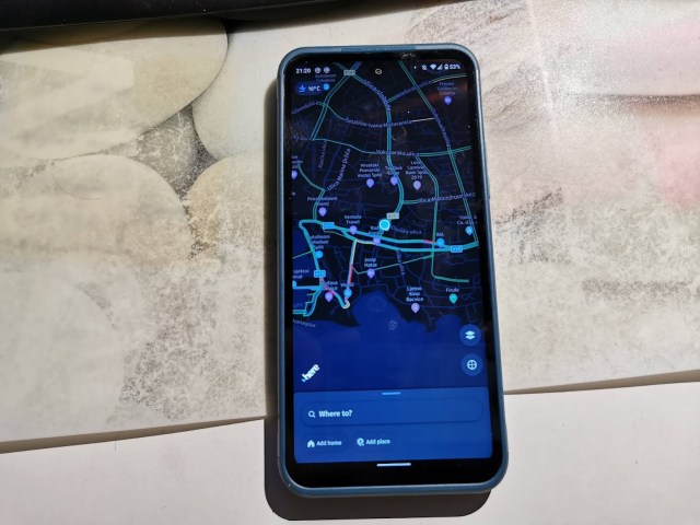
The design is bringing a new UI that makes using the app much easier. Once you open it and eventually sign in to get your account details, the main screen presents to you with temperature in the upper left corner and an address bar at the bottom where you can start searching for directions. If you swipe up the address bar up with your finger, you are opening a menu that is showing you your collections, the offline maps button and account settings with general app settings below it.

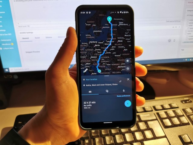
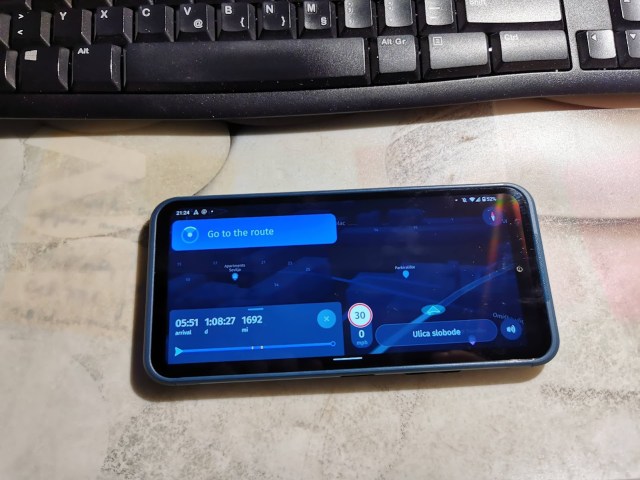
And that is basically it. You just need to type the subject that you want to reach by car, public transport or by foot and off you go. The app will find the best route, and after you click the directions button, switch you to the driving mode, which works in a horizontal position also. The buttons inside the driving part of the app are pretty large, which is super convenient when you want to press something during driving.

How do you like the new version of the app? Are you using HERE We Go or you are trusting Google to find the best direction for you?
Cheers shonjoss for the tip 😉


